Category Oil Energy
MarketScale Podcast
Economics of Oil
Advances in technology such as seismic imaging with Dawson Geophysical and horizontal drilling with Schlumberger have dramatically changed the economics of oil and gas extraction. The change in oil economics is so profound that the cost structure of hydrocarbon fuels will reverberate through the global energy market and impact pricing of renewables energies and investment decisions. So profound are these changes that the US has surpassed Saudi Arabia and emerged as the world’s largest oil producer.
With the price of oil falling as a result of large production gains in US oil production. The price of oil is may fall below $40 per barrel according to an article in Barron’s The Case for $35 a barrel Oil suggesting further oil price declines are possible.
Perspective on Global Oil Consumption – Possible Plateau for Oil Consumption?
Global oil demand grew 0.6% in 2012 and over the last ten years oil consumption grew at a compounded annual growth rate (CAGR) of 1.3%. With near term oil demand at a lower level then the trend for the past ten years suggests the pace in oil consumption is slowing.
According to the Energy Information Administration (EIA), EIA the trend in oil consumption is pointing towards slower if not anemic growth. In the two largest areas, the US and Europe, demand is for oil is declining. While the increasing demand for oil in China and India is significant, the rate of growth is slower.
Figure 1 Global Oil Demand 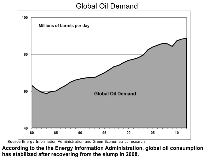
In the US, oil demand declined 2.1% in 2012 and over the last ten years oil consumption is down 0.6%. The oil consumption trend in the US suggests the decline maybe more structural, particularly as vehicle fuel efficiency is improving and high oil prices may change consumer-driving habits.
Figure 2 Oil Consumption – Major Countries 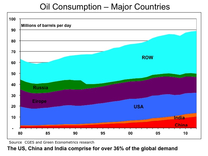
While the economic weakness in Europe and moderating growth in China, it is not surprising to see weakness in global oil demand. The trend is lower oil consumption might just be the result of short term economic weakness.
Europe and the US account for over 37% of the global demand for oil and that demand has declined over the last ten years. While the US was down 0.6%, demand for oil in Europe was down 1.1% in the last ten years.
Figure 3 Oil Consumption Perspective 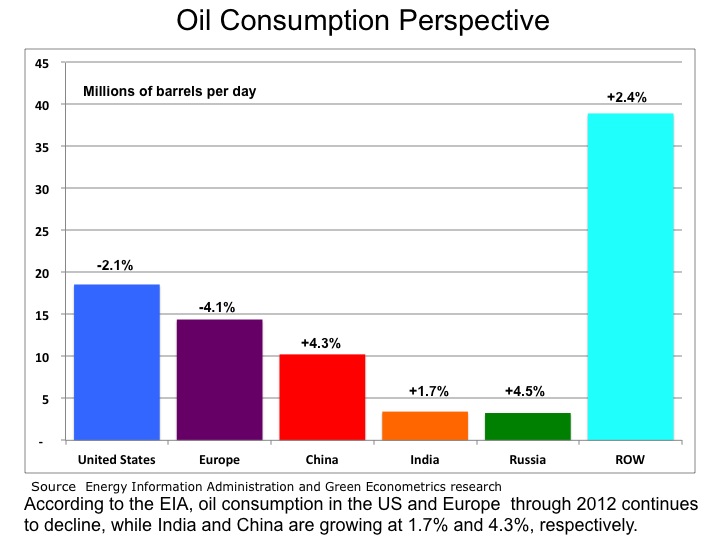
There is still strong demand for oil in China and India, but the rate of growth has slowed. China and India represent 15% of the global demand for oil. China and India have one-year oil demand growth rates below their respective ten-year rates.
Figure 4 Oil Consumption Trends 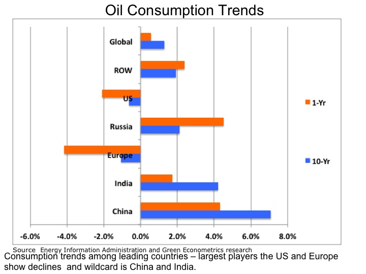
The bottom line is that is demand for oil has slowed and it maybe at a point where oil prices may soon reflect slowing demand.
Update on Oil Consumption
The latest data on oil consumption suggest the dip in consumption that appeared in 2008 after the global financial crisis quickly reversed. The contraction in oil has now turned to expansion with consumption up 4% y/y globally.
According to the latest reported information from the Energy Information Administration (EIA), EIA oil consumption is up 4% for 2010 from 2009. The data oil consumption data suggests the global economy has recovered from the financial crisis and is translated into higher oil demand.
Figure 1 Global Oil Demand 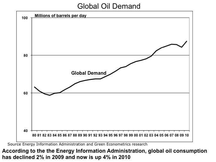
WE have seen economic contraction result into declines in oil demand before. Oil demand dropped in the 1979 to 1983 period with of a 10% decline per year. On a global basis, oil demand declined approximately 2% in 2009 from 2008, but is not up nearly 4% in 2010
In the US, oil demand dropped 5.7% in 2008 and 3.7% in 2009 with demand in 2010 increasing 3.8%. The oil consumption trend in the US suggests the decline in oil demand was cyclical as apposed to any structural changes in US consumer demand.
Figure 2 US China & India Oil Consumption 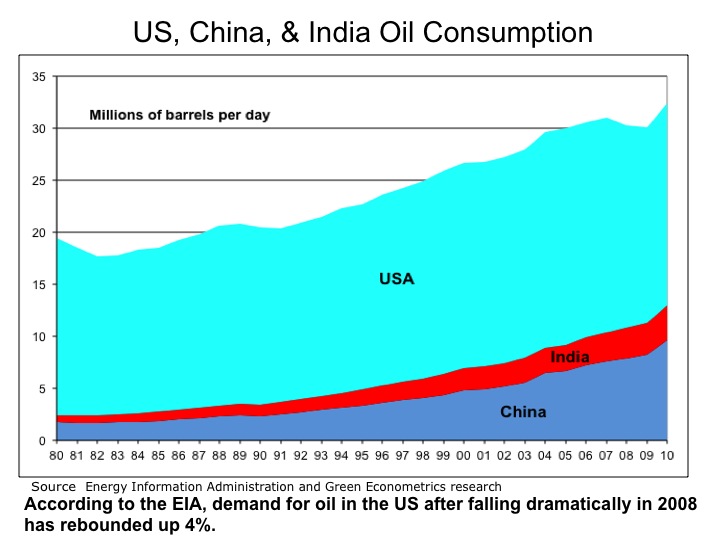
The real story is the growing demand for oil from China and India. According to data from The Centre for Global Energy Studies (CGES) , the demand for oil from China is up 100% from in the last ten years. China’s oil consumption rate has grown from 4.8 million barrels per day (MBPD) to 9.6 MBPD amounting to half of the total US consumption. In 2010 the growth in oil demand in China is up 17%.
The demand for oil in India is also increasing. Oil consumption in India is up 58% in the last ten years and up 8% in 2010.
Figure 3 China and India Oil Demand 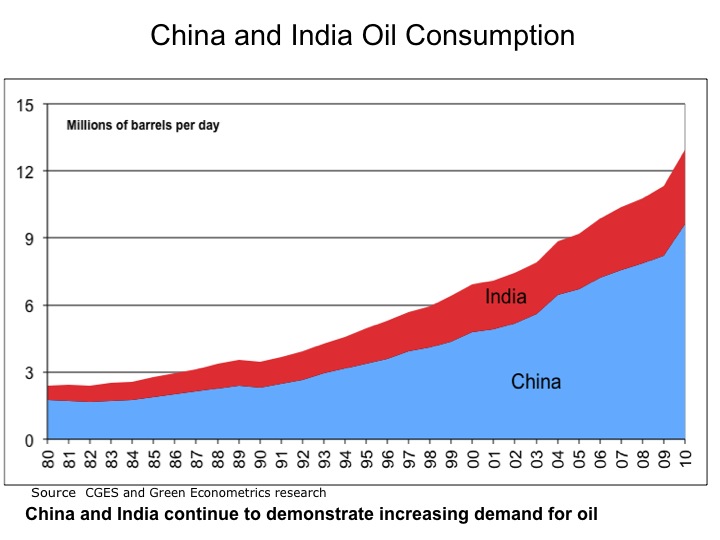
The bottom line is that is demand for oil continues to increase and we expect further increase in oil prices.
Infrastructure Investment: Electric Vehicles and Smart Grid
2010 Update on Oil Consumption and CO2 Levels?
The worst global economic recession in since the Great Depression seems to be abating. Given the severity of the financial crisis, it might serve to review what impact the recession has had on oil consumption. In addition, what impact did the decline in oil consumption have on atmospheric CO2 concentration levels?
Since 2006, global oil consumption declined by 1.1 million barrels per day (BPD) from 85.2 in 2006 to 84.0 in 2009. Oil consumption in the US declined 9% to 18.8 million from 20.7 million BPD in 2006. Europe experienced a decline of 7% over this same period with a drop of 16.5 million to 15.2 million BPD. However, over this same period, oil consumption in China and India increased 16% and 13%, respectively. This data was complied from the US Department of Energy Information Administration (EIA) and is displayed in the following charts.
To measure how significant the impact has been, the following charts provide some insights in evaluating how deteriorating world economies may have impacted oil consumption and secondly, whether reduced oil consumption has mitigated heightened CO2 levels.
Figure 1 Global Oil Consumption 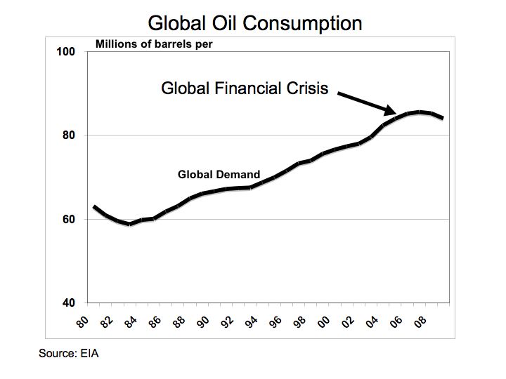
Source: EIA
From Figure 1, the impact of the global financial crisis is depicted with the decline in global oil consumption. When a comparison is applied to oil consumption between the US China, and India, the relative drop in oil consumption is less discernable.
Figure 2 US, China, and India 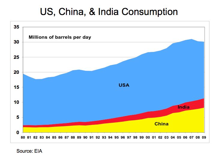
Source: EIA
Figure 2 provides a summary of oil consumption of the US, China, and India. A measurable decline in oil consumption can be seen, but only in the US market.
Figure 3 China and India 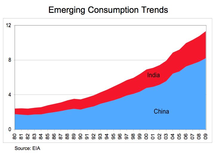
Source: EIA
Figure 3 demonstrates the steady and pronounced growth in oil consumption for China and India. Despite the global financial crisis, oil consumption significantly expands in China and India due to secular growth from rapid industrialization in both countries. When measured with respect to the European market, China and India have grown from 15% of the oil consumption rate of Europe in 1980 to over 74% of the consumption level in 2010.
Figure 4 CO2 Levels 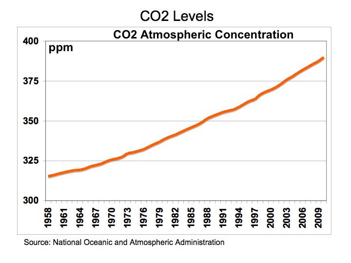
Source: NOAA
With the decline in global oil consumption, perhaps a positive benefit would be a fall in CO2 levels. The atmospheric CO2 readings in part per million (PPM) where taken from the National Oceanic and Atmospheric Administration (NOAA) from the Mauna Loa CO2 Levels monthly measurements. Figure 4 illustrates the average annual atmospheric CO2 concentration readings in Mauna Loa, Hawaii from 1980 through 2010.
The bottom line is even while global oil consumption declined during the recession, growth in China and India remained unabated and subsequently, CO2 concentrations in the atmosphere continue at elevated levels.
In memory of Jamie Kotula – loved by family, friends, teammates, and school.
Heating and Cooling – Does Insulation Pay?
Insulation is one of the most important factors in improving building energy efficiency. Heating, ventilation and cooling (HVAC) often accounts for more than half the energy expense of a building. Insulation helps to improve the energy efficiency of heating and cooling. Depending on the selected insulating material, the economic impact on heating costs can be quite dramatic.
To understand how insulation helps improve building heating and cooling, it’s helpful to review the dynamics of building heat loss as it applies to building materials and outside actual air temperatures.
To calculate the heating requirements for a building, the overall heat loss from a building can be derived as a function of the combined heat loss of transmission through the roof, walls, windows, doors, and floors, as well as heat loss caused by ventilation and air infiltration. In general, without getting too scientific, the heat loss from transmission through roof, walls, doors, and windows represents the largest impact and is primarily a function of the temperature difference between the inside and outside air and thermal conductance of he building material. For a more detailed review of building heat loss see Heat Loss.
The difference between inside and outside temperature plays a critical role in building heat loss. The first step is to understand heating and cooling requirements from weather data. Heating degree day (HDD) are a measure of energy demand required to heat a building. HDD is derived from the difference between the daily outside temperature observations and the ideal indoor air temperature, say 65 degrees Fahrenheit (18.30 Celsius). The heating requirements for a building in a specific location can be derived from the HDD data in conjunction with building factors such as insulation, windows, solar heat gain, and use. Air conditioning also has a similar metric and is defined as cooling degree day (CDD) and measures the amount of energy used to cool a building.
From the historical data on outside air temperature, an average heating and cooling degree day can be assigned to a specific region. To calculate degree days for both heating and cooling Daily Temperatures can be assessed by zip code to capture historical data on specific climate zones.
When it comes to selecting building materials and insulation, material suppliers often supply two measures – the R-value and C-value. A material’s R-value (thermal resistance) is the measure of its resistance to heat flow. The C-value (thermal conductance) is the reciprocal of thermal resistance and measures the ability of a piece of material to transfer heat per unit time or more specifically, specifies the rate of energy loss through a piece of material.
The US Department of Energy (DOE) has provided revised R-value recommendations based on climate zones. To understand the energy impact of selecting the right R-value insulation material for your building, an on-line heating calculator will help illustrate the heating requirements and associated energy costs for different insulating materials. Building heating requirements are often expressed in BTU (British Thermal Units) per cubic foot.
The Heater Shop BTU Calculator Heating Calculator provides some useful insight into managing energy expenses. The calculations were based on an average of 25 HDD for New York City.
Figure 1 illustrates the heating requirements as measured by BTU per square foot of building space for corresponding insulating materials across ceiling heights from 10 to 40 feet to capture cubic feet. As seen from Figure 1, the heating requirements show significant variance depending on insulation assumptions.
Figure 1 BTUs per Square Foot 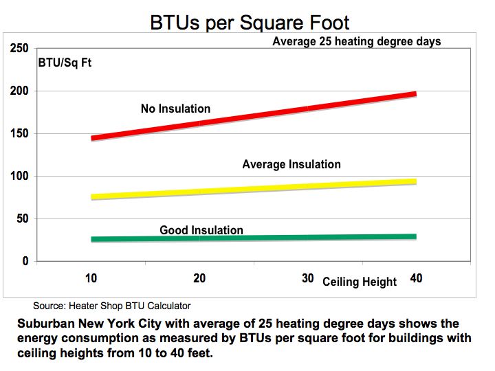
Source: Heater Shop BTU Calculator
Taking the building heating requirements one-step further, different insulating assumptions (no insulation, average, and good) translate into wide dispersion in operating costs. The on-line heating calculator was used to estimate the building heating requirements based on the following assumptions: 10,000 square foot facility with ceiling height of 10 feet for 25 HDD for no-insulation average insulation, and good insulation. To derive fuel costs, the BTU per square foot for each insulation category was applied to a heating system operating for five heating months with approximately 1,400 hour of operations to coincide with a gas furnace at 90% efficiency and 20-minute on-cycle and 30-minute off-cycle. Gas pricing for heating are based on $17.00 per million BTU.
Figure 2 Heating Energy Cost 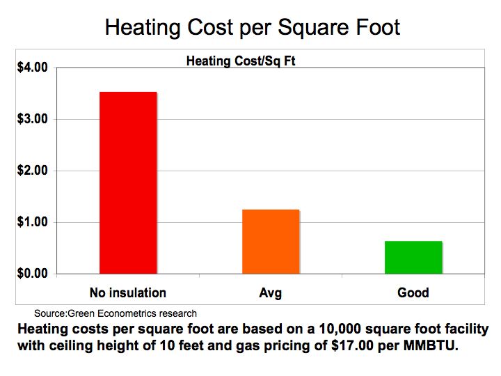
Source: Green Econometrics research
Figure 2 demonstrates that heating cost per square foot for good insulation saves approximately $2.90 per square foot in comparison to no-insulation at all. If we compare the heating costs savings to the cost of insulation, the payback period for insulation can be achieved in a year under most circumstances.
Figure 3 Insulation Cost 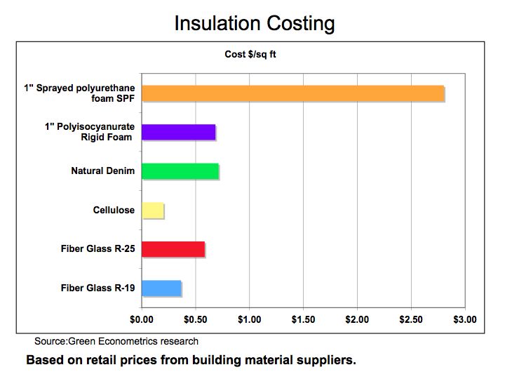
Source: Green Econometrics research
To assess the C-value and R-Value of various building materials, there are some useful charts available on the web. Insulation and Building Materials R-Values
The bottom line is that insulation is one of the most important building components materials to improve energy efficiency and lower utility costs.
Should we be Concerned over Elevated CO2 levels?
With the oppressive heat and appalling humidity along the Eastern Seaboard, one considers the possibility of climate change and the impact of that greenhouse gases may have on our environment. Without developing statistical regression models to gleam any semblance of understating of carbon dioxide’s impact on climate change, let’s just look at some charts that illustrate the changes of CO2 levels though history.
While industry experts and scientist debate whether elevated CO2 levels have an impact on climate change, the scientific data taken from ice core samples strongly suggests CO2 levels have remained in a range of 180-to-299 parts per million (PPM) for the last four-hounded thousand years. Scientists have developed models to suggest that rising CO2 levels contributes to global warning which are subsequently followed by dramatic climate changes that lead to periods of rapid cooling – the ice ages.
Scientific theories suggest that rising global temperatures melts the Polar ice which allows substantial amounts of fresh water to enter the oceans. The fresh water disrupts the ocean currents that are responsible for establishing a nation’s climate. As oceans warm near the equator, the warmer water travels towards each of the Polar areas. The cooler water near the Polar areas sinks and travels towards the equator. These ocean currents allows for stable climates. The issue is that fresh water is less dense because it is not salty like seawater. Therefore, the fresh water does not sink like the cold salinated seawater thereby disrupting the normal flow of the ocean currents.
Figure 1 CO2 Ice Core Data – illustrates the level of CO2 over the last four-hounded thousand years. The Vostok Ice Core CO2 data was compiled by Laboratoire de Glaciologie et de Geophysique de l’Environnement.
Ice Core Data
Figure 1 CO2 Levels – Vostok Ice Core CO2 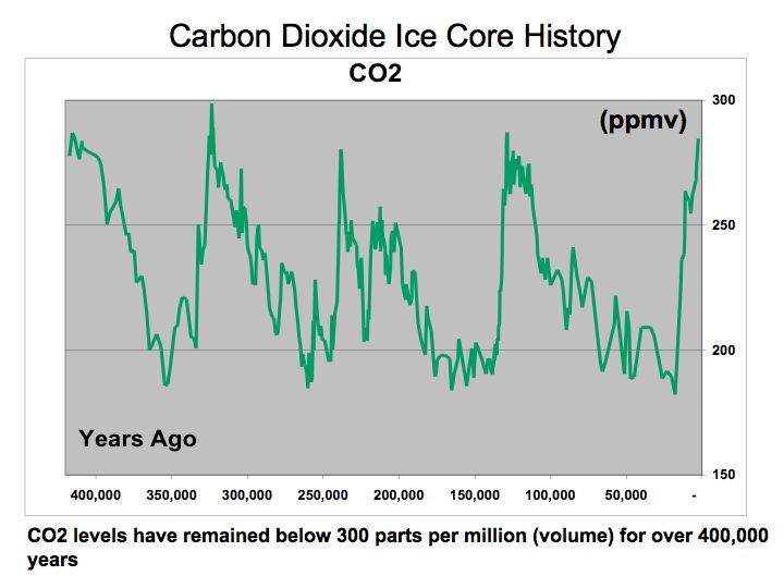
Source: Laboratoire de Glaciologie et de Geophysique de l’Environnement
If this Ice Core CO2 data is correct, then the current data on atmospheric CO2 levels is quite profound. CO2 data is complied by the National Oceanic and Atmospheric Administration NOAA at the Mauna Loa Observatory in Hawaii. The latest trend indicates CO2 levels for June 2010 are at a mean of 392 ppm versus 339 in June 1980 and 317 in 1960. Clearly these CO2 levels are elevated. The question is what is the impact on our environment.
Aside from the catastrophe in the Gulf of Mexico and the dire need to find an alternative to our dependence on oil, should we not accelerate our efforts to find an alternative energy solution and as a way to mitigate the impact of CO2 on our environment? Maybe investment into alternative energy could help solve multiple problems.
Figure 2 Mauna Loa CO2 Readings 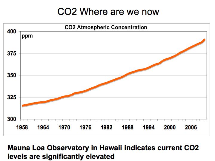
Source: Source data published by the National Oceanic and Atmospheric Administration (NOAA)
The bottom line is that we need to consider the possibility that elevated CO2 levels in our atmosphere could potentially have a detrimental impact on our climate. In any event, limiting our dependence on fossil fuels, the main contributor to CO2, should be paramount. Let us not forget oil is supply-constrained – there are no readily available substitutes aside from electric vehicles, and without a strategy to embrace renewable energy, supply disruptions will have a painful impact on our economy, national security, and environment.
Energy Perspective
After reviewing oil data from the Energy Information Administration (EIA), Global Petroleum Consumption , it may be helpful to put energy consumption into perspective. Most of us are quite familiar with alternative energy such as solar and wind, but the reality is, even if solar and wind could supply all of electric energy needs, the majority of our energy needs is still predicated on access to oil.
While industry experts and scientist debate whether more drilling will ameliorate the energy challenge we face, let’s look at a couple of data points. Figure 1 US Oil Field Oil Production and Drilling Rigs – illustrates that higher drilling activity as measured by Baker Hughes Rig Count data does not necessarily correlate to more oil production as measured by US Oil Field Production by the EIA. Higher drilling activity does not produce more oil.
Figure 1 US Oil Field Production and Drilling Rigs 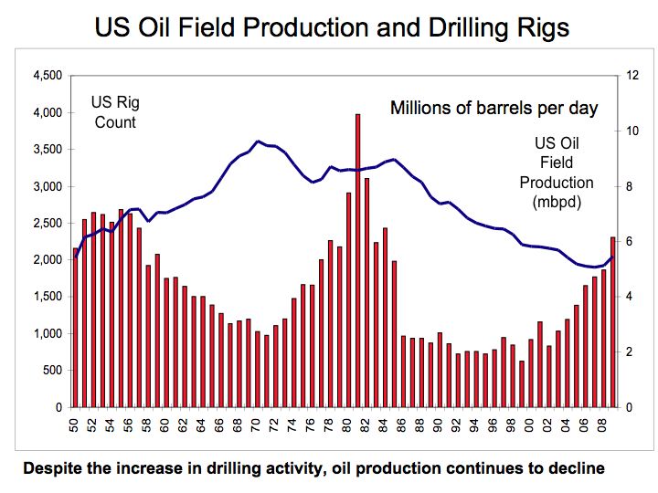
Source: Energy Information Administration and Baker Hughes research
Despite the large investment in drilling rigs that more than doubled from 1,475 in 1974 to over 3,100 in 1982, US oil production remained relatively flat. Moreover, even the most recent drilling expansion activity that again more than doubled from 1,032 rigs in 2003 to over 2,300 rigs in 2009, resulted in relatively flat oil production, suggesting that on the margin unit oil production per drilling rig was declining. Perhaps even more disturbing is that the most recent drilling activity in the US was accomplished through extensive use of technology. Seismic imaging technology is being used to better locate oil deposits and horizontal drilling technologies are employed to more efficiently extract the oil, yet oil production still lags historic levels. While on the margin, newly announced offshore drilling could add to domestic oil production, extraction costs of oil will continue to rise adding to further oil price increases.
However, what is most profound is our dependence on oil for most of our energy needs similar to how wood was used for fuel construction material during the 1300’s and 1600’s. If we translate energy consumption into equivalent measuring units such as kilowatt-hours, we can compare and rank energy consumption. Although electricity is captured through consumption of several fuels most notably coal, a comparison of energy usage between oil and electric provides an interesting perspective.
Figure 2 Energy Perspective – provides a simple comparison of the consumption of oil and electricity measured in gigawatt-hours (one million kilowatt hours). A barrel of oil is equivalent to approximately 5.79 million BTUs or 1,699 KWH and the US consumed approximately 19.5 million barrels per day equating to 12 million gigawatt-hours a year. The US uses 4 million gigawatt-hours of electric energy annually. The critical point is that even if solar and wind supplied all of our electric energy needs, it would still only comprise 30% of our total energy needs. Therefore, without an energy strategy that facilitates migration towards a substitute for oil, particularly for transportation, we are missing the boat.
Figure 2 Energy Perspective 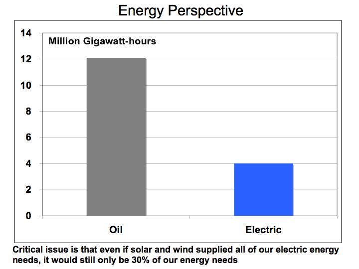
Source: Energy Information Administration and Green Econometrics research
It’s not all doom and gloom. Technologies are advancing, economies of scale are driving costs lower, and the economics for new approaches to transportation are improving. From hybrids and electric vehicles benefiting from advances lithium-ion batteries to hydrogen fuel cell vehicles getting 600 miles on a tank of fuel. These advanced technologies could mitigate our addiction to oil, however, without formulating an energy strategy directing investments towards optimizing the economics, energy efficiency, environment, and technology, we may miss the opportunity.
The bottom line is that oil is supply-constrained as there are no readily available substitutes, and therefore, without a means to rapidly expand production; supply disruptions could have a pernicious and painful impact on our economy, national security, and welfare.
Global Oil: Economic Recovery should Drive Demand and Price
Despite the global economic recession, preliminary data suggest oil demand remains rather resilient. According to the latest reported information from the Energy Information Administration (EIA), Global Petroleum Consumption is down one percent y/y in 2008 while China and India show increases of 4% and 5%, respectively. However, current data through September 2009, show oil demand fell quite precipitously in the US. Through September 2009, oil consumption is down over two million barrels per day form the 2007 annual average (an 11% decline). Most of the change in oil consumption is cyclical and with an economic recovery expected, oil demand should rebound and perhaps drive prices higher.
Figure 1 US Average Annual Oil Consumption 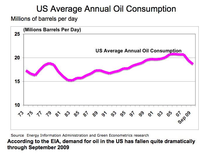
Historically, the US has seen this type of demand erosion before. From 1979 to 1983, oil demand in the US declined 28% with annualized rate of a 10% decline per year. Over this same period, oil prices actual rose despite the fall in demand. Oil prices by barrel (42 US gallons) rose from $3.60 in 1972 to $25.10 in 1979. Oil prices are up significantly in 2009. In January 2009, oil was traded at $33.07 a barrel and in January 2010, oil is trading at 2010 Oil prices $78.00 per barrel.
On a global basis, oil demand has only contracted by one percent in 2008, the latest data from the IEA. Despite the fall out in US oil demand, global markets driven from demand from China and India, has kept the global demand for oil relatively stable.
Figure 2 Global Oil Demand 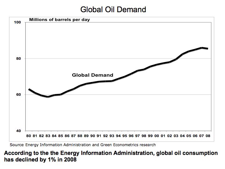
The growing demand for oil from China and India increased their respective share of the global oil markets from 3% and 1%, respectively in 1980 to over 9% and 3% in 2008. At the same time, the US share of global oil consumption has declined from 27% in 1980 to under 23% in 2008. See Figure 3 China and India Oil Demand.
Figure 3 China and India Oil Demand 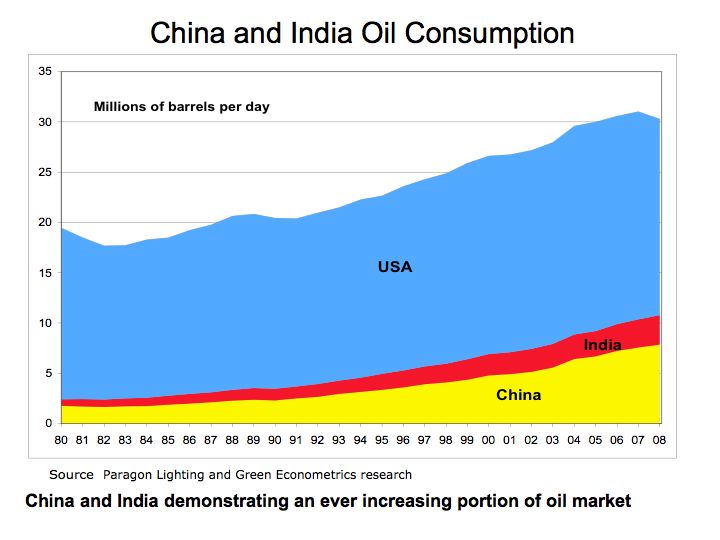
The bottom line is that as financial growth emerges across the globe, oil demand should increase commensurately and with oil process already at elevated levels, further prices increases are expected. – demand for oil will increase and so will oil prices.
Formulating an Effective Energy Efficiency Strategy with Measurement and Verification Copyright © 2009 Green Econometrics, LLC
The development of an energy efficiency strategy incorporates analysis of energy expenditures and energy consumption. The energy strategy must incorporate dynamics between costs, budgets and the consumption of energy including the monitoring of kilowatt-hours (KWH) of electricity and liquid hydrocarbon fuels consumed. By analyzing both the financial and the energy consumption components we are better positioned to frame the scope of the energy efficiency projects.
We start with a comprehensive energy audit analyzing energy consumption and expenditures. After determining which activities offer the fastest, cheapest, and greatest economic impact we are then able to define the scope of energy efficiency projects. The next step in the energy strategy process is to assess, rank and specify energy saving opportunities. At this phase, we have a broad understanding of the scope of energy efficiency projects within the appropriate budgetary considerations.
Conduct Energy Audit and Analyze Energy Spending
Upon analysis of the energy expenditures and the appropriate budgetary considerations, we commence with an energy audit to examine the dimensions of energy consumption. The energy audit establishes an energy efficiency baseline for buildings and vehicles. In the energy audit, energy consumption is measured by source and activity using monitors attached to branch circuits, gas pipes, and fuel lines. In this manner, energy consumption is evaluated from a financial and physical perspective and baseline usage patterns are established for electricity and other fuels.
During the energy audit, an analysis of energy intensity is measured. For buildings, energy consumption is measured in kilowatt-hours per square-foot to identify which activities consume the most energy. The energy intensity measurements are then ranked by consumption activity and compared to actual energy expenditures.
The purpose of the energy audit is to establish a baseline of energy consumption and the energy intensity associated with each building, department, vehicles, and/or activity usage category. By constructing an effective energy efficiency strategy that identifies and measures energy demand by activity, a better understanding of economic- and financial-impact is established. The critical component to the energy audit is measurement and verification were wireless Internet-based energy monitoring provide data before and after energy efficiency projects commence. The energy audit and energy monitoring systems together with financial analysis of energy consumption serve as the framework to rank and assess energy efficiency projects.
Heuristically, energy consumption in buildings is tied to lighting; and heating, cooling, and ventilation systems see Energy Intensity . The following chart, Figure 1 serves to illustrate which activities contribute most to energy consumption in buildings.
Figure 1 Kilowatt-hours (KWH) per Square Foot 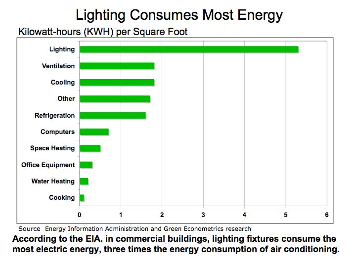
According to information provided by the DOE, lighting, cooling and ventilation alone account for nearly two-thirds of all energy consumption in a building. For perspective, electric energy demand is increasing at an annualized rate of 1.6%. According to the Energy Information Administration (EIA), demand for electricity grew 21% between 1995 and 2006.
The energy consumption audit provides a means to assess which activities should be further analyzed for energy efficiency projects. The baseline energy usage measured in KWH per square foot serves as the framework to evaluate that locations and activities could benefit from lighting retrofits, equipment upgrades, structural improvements, and energy monitoring systems.
As a consequence of increasing energy consumption in buildings, electric generation relies extensively on hydrocarbon fuels that carry adverse environmental effects. Figure 2 illustrates the proportion of coal and other hydrocarbon fuels that are used to generate electricity in comparison to renewable energy sources. Coal still accounts for nearly half of all electric generation while contributing the most in terms of harmful emissions such as carbon dioxide, nitrous oxide, and sulfur dioxide.
FIGURE 2: Electric Generation Method 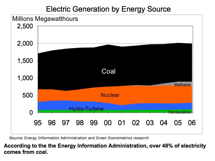
As part of the energy audit process for buildings, an energy consumption analysis of lighting and HVAC systems is evaluated along with the building’s insulation R-Value (resistance to heat flow where the higher the R-value, the greater the insulating effectiveness). In addition to lighting and HVAC systems, specialized equipment may also account for large energy demand. During our energy audit, we plan to identify and measure energy usage of special equipment in order to construct energy efficiency initiatives with clearly defined and measurable energy reduction targets.
Energy efficiency for transportation vehicles is one of the most significant factors to manage. The fact that there are no real substitutes for oil in the transportation industry illustrates two important points: 1) structural changes to driving patterns are required to see appreciable changes to oil consumption and 2) government authorities are vulnerable, with no readily available substitutes for oil, supply disruption could negatively impact transportation systems. Therefore, we emphasize fuel management systems for fleets and vehicles that monitor fuel consumption and efficiencies. DOE studies have indicated that changing driving habits could improve fuel efficiency by up to 30%.
Vehicle mounted devices that integrated fuel consumption feedback as the vehicle is driven promotes higher fuel efficiency. These off the shelf products are cost-effective, offering payback in months that dramatically improves fuel efficiencies. Aside from routine tune-ups, limiting weight, and checking tire pressure, augmenting driving patterns through gauges that provide feedback on fuel efficiency make the difference in saving energy.
In most situations, fuel management systems can be installed without significant mechanical aptitude. The ScanGaugeII from Linear-Logic is useable on most vehicles manufactured after 1996 including Gas, Diesel, Propane and Hybrid Vehicles and are designed to be installed by the consumer with plug-and-play instructions.
Identify and Measure Energy Demand by Activity
From the Energy Audit, the energy intensity of targeted buildings and fuel efficiencies of official vehicles are established. In buildings, it’s the lighting and heating, ventilation, and cooling that comprise the bulk of energy consumption.
Heating, ventilation, and cooling represent a significant portion of energy consumption in buildings and are a priority target for energy analysis. The Seasonal Energy Efficiency Ratio (SEER) is employed as an assessment of the equipment and analyzed in conjunction with building insulation. The efficiency of air conditioners is often rated in SEER ratio, which is defined by the Air Conditioning, Heating, and Refrigeration Institute and provides a standard unit measure of performance. The higher the SEER rating of a cooling system the more energy efficient the system is. The SEER rating is the amount of BTU (British Thermal Units) of cooling output divided by the total electric energy input in watt-hours.
For heating systems in a building, Annual Fuel Utilization Efficiency (AFUE) is used to measure and compare the performance of different systems. DOE studies have indicated that even with known AFUE efficiency ratings, heat losses defined as idle losses contribute to degradation in heating system efficiency,
To analyze energy consumption of heating and air conditioning systems (HVAC), we evaluate the building’s R-Value in comparison to the energy efficiency of the current heating and air conditioning systems. The energy demand evaluation includes a cost-benefit analysis comparing options in either HVAC system upgrade and/or improvements to the building’s insulation R-Value. By comparing the buildings R-Value in conjunction with HVAC efficiency performance, projects offering the greatest cost effectiveness are identified. The building’s R-Values can be measured using FLIR Systems infrared camera and software system. In this manner, the replacement cost of an HVAC system and costs to improve the building’s R-Value are analyzed to measure economic benefits. This information will allow the building owner to make an informed decision on whether any energy efficiency investment into HVAC upgrade or improvement to R-Value demonstrate economic benefit, i.e. positive financial return.
Consideration for heating and cooling systems upgrades are assessed by equipment SEER and AFUE ratings, installation costs, and efficiency payback. After equipment assessment is complete, proposals will be provided along with estimates for upgrade costs and payback analysis.
Benchmark and Analyze Energy Intensity
After conducting the energy audit, and compiling data on energy usage by activity category, we benchmark and analyze energy projects offering the greatest opportunities. As illustrated in Figure 3, energy efficiency for lighting systems can be substantially improved by retrofitting legacy light fixtures with higher efficiency fixtures and bulbs.
The energy audit and analysis provide the framework to evaluate energy efficiency projects. By analyzing energy consumption and the economic benefits associated with the energy savings projects, the most efficient and economically beneficial initiatives are identified and ranked.
FIGURE 3: Energy Savings in KWH per Square Foot Figure 1 Kilowatt-hours (KWH) per Square Foot 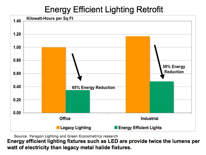
Establish Measurable Goals and Objectives
To establish relevant goals and objectives we are evaluating projects that are adhering to the SMART goal approach: specific, measurable, attainable, realistic and timely. Energy efficiency gains are most pronounced with lighting retrofits and energy monitoring in buildings in buildings and energy monitoring in vehicles.
After conducting an energy audit, analyzing energy consumption activities and the economics of energy efficiency projects, realistic and achievable energy savings goals are defined. Key performance metrics for energy savings are defined for buildings and vehicles. Key performance indicators are established for each project. For example, KWHs saved are defined for lighting retrofit projects, efficiency improvements for HVAC system upgrades, R-Value improvements for building insulation, and MPG gains for vehicles.
For each energy savings project, timelines are established with clearly defined milestones. Energy projects are presented with costs; expected energy savings measured in energy and dollar units, cost benefit analysis, and timelines.
Architect the Deployment of Energy Monitoring Systems
One of the first energy initiatives to consider in any energy savings project is the installation of an energy monitoring system for vehicles and buildings. Energy monitoring systems demonstrate the fastest and most economical pathways to achieving energy savings.
Energy monitoring systems for motor vehicles also demonstrate positive economic returns and real energy savings. The $180 energy-monitoring device with 10% fuel efficiency gain achieves breakeven at 14,500 miles with gasoline costing $2.50 a gallon.
Evaluate Feasibility of Renewable Energy Projects
Renewable energy projects such as solar and wind energy systems are often costly with long payback periods. Without tax incentives and grants, renewable energy projects are unable to demonstrate positive financial returns. However, utility rates for electric are expected to increase, improving the case for renewable energy projects. To improve the viability of alternative energy projects, energy efficiency projects such as lighting retrofit serve to lower energy consumption and therefore enhance the feasibility of solar and wind energy projects.
Oil Consumption Impacted More by Price than Deteriorating Economic Conditions
The fall in oil consumption was most dramatic following the escalating price of crude oil to $145.16 per barrel on July 14, 2008 then at any other point over the last several years. Price elasticity, a key concept in Economics 101, which measures the impact of price change to changes in unit volume sold, is helpful in determining which products have readily available substitutes or which, like oil are inelastic with no real substitutes.
As illustrated by Benjamin Graham and David Dodd in their book Security Analysis, 1940 edition, during the 1930’s the economy had a dramatic impact on spending and consumption particularly on discretionary items such as travel. In one illustration, the change in demand was most pronounced in railroad revenues where tickets purchased for railroad travel, declined 51% from 1929 to 1993 as measured by gross receipts for the railroad industry. Over this same period, spending on the consumer staples (inelastic demand), such as electricity encountered a decline of only 9%.
While almost everyone would agree that the current economic climate is one of the most challenging since the 1930’s, a quick review of oil consumption over the last several years illustrates that demand has not significantly contracted, suggesting driving habits only changed when prices escalated to over $100 per barrel. Oil consumption dropped only 4.9% from January 2008 through January 2009.
Figure 1 Oil Consumption 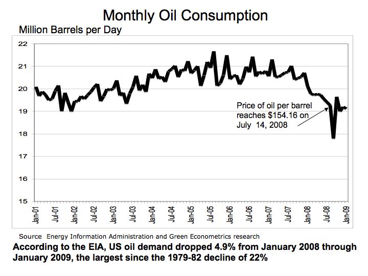
As seen from Figure 1, the sharp drop in oil consumption in September 2008 of 8.3% appears as an aberration when measured over the whole year. The fact there are no real substitutes for oil in the transportation industry illustrates two important points: 1) structural changes to driving patterns are required to see appreciable changes to oil consumption and 2) how vulnerable we are as a nation with no readily available substitutes for oil in the transportation systems.
Figure 2 Oil Demand in China and India 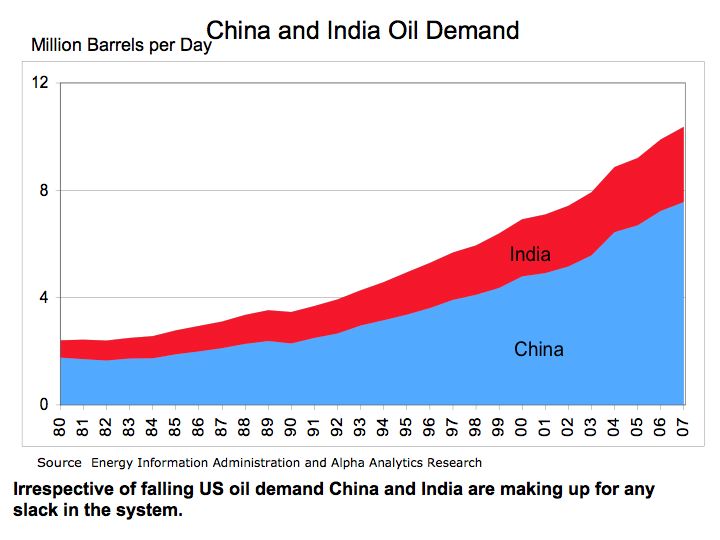
With China and India undergoing significant structural changes as they rapidly migrate towards motor vehicles for transportation suggests the demand for oil should continue to grow relatively unabated. Until the price of oil climbs back over $100 per barrel, we will not see the structural changes necessary to develop alternatives to oil in the transportation market.
The bottom line: energy and in particular, oil has not experienced a dramatic drop in demand during 2008 suggesting driving patterns were influenced more by the price of oil then the struggling economy. We must begin to shift emphasis to alternative energies such as solar as well as hybrids and electric vehicles.
Solar Energy – Closer to Grid Parity?
Last month First Solar (FSLR) achieved a milestone in the solar industry with its announcement of $1 per Watt reducing its production cost for solar modules to 98 cents per watt, thereby braking the $1 per watt price barrier.. While the achievement is great news for the solar industry some studies suggest more work is needed. An article in Popular Mechanics $1 per Watt talks of university studies questioning the scalability of solar given the immense global needs for energy. Last year our post included an article Solar Energy Limits – Possible Constraints in Tellurium Production? discussing possible limits on tellurium production on thin film solar photovoltaic (PV) suppliers.
In addition, Barron’s published an article (March 30, 2009)_ Nightfall Comes to Solar Land providing unique insight into the economics of solar PV suppliers. High oil prices and soaring stock prices on solar PV companies fueled silicon suppliers to ramp production capacity that has now transitioned, according to the Barron’s article, into an over supply of polysilicon used in the production of PV panels and subsequently, eroding the cost advantage established by thin film PV companies such as First Solar and Energy Conversion Devices (ENER) over polysilicon PV firms such as SunPower (SPWRA).
However, the PV panels typically represent approximately half the cost of a solar energy system. The following figure, Solar Installation Costs compares the total cost of installing a solar energy system which includes labor and supporting matertials.
Figure 1 Solar Installation Costs 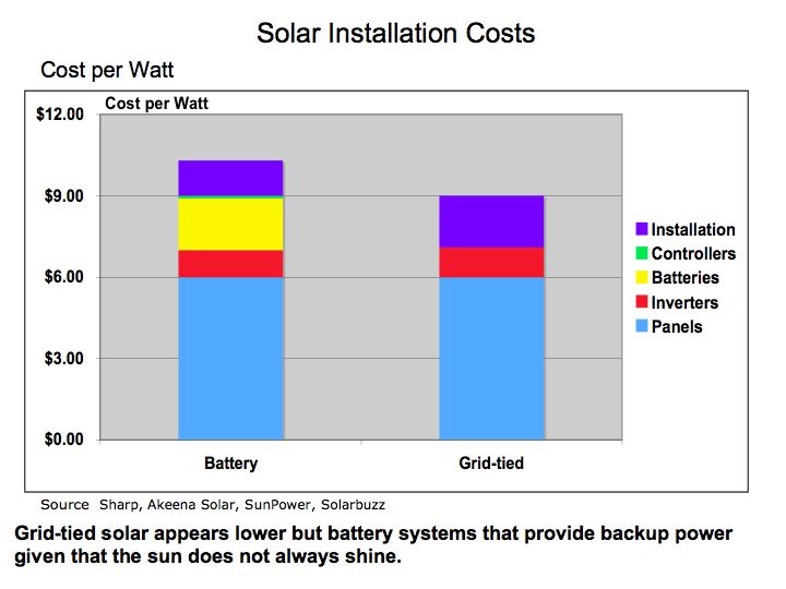
As illustrated in Figure 1, the panels represent a significant cost of installation, but the labor and support brackets for the PV panels are significant as well. While thin film PV enjoys significantly lower panel costs and is easier to install, the supporting brackets are sometimes more expensive. As prices for silicon fall, the cost disparity between thin film and silicon PV will narrow.
Figure 2 Solar Energy Economics 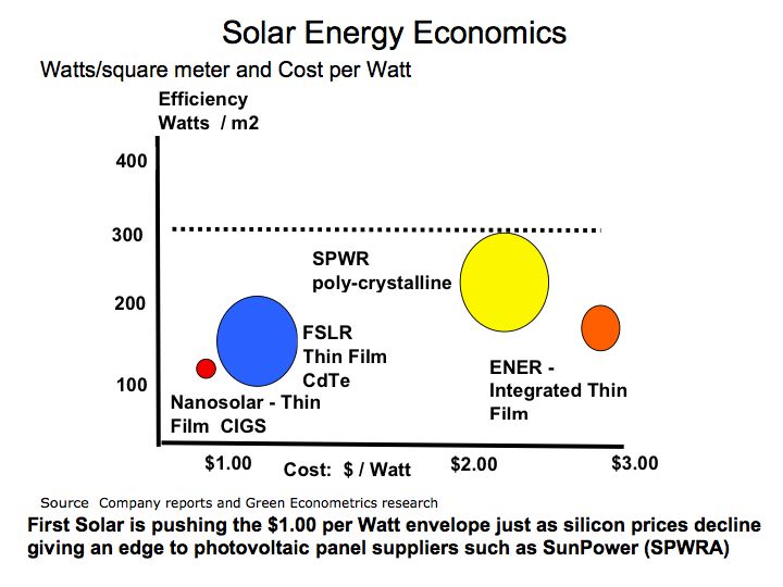
In Figure 2 Green Econometrics is comparing PV efficiency as measured by watts per square meter versus cost per watt. The selected companies represent a small portion of the global PV suppliers, but do illustrate the position of the leading US suppliers. The ideal model is to lower cost per watt while improving PV efficiency. But be cognizant that PV module cost per watt may not be indicative of the total system costs.
A comparison of wind and solar energy costs is demonstrated by Detronics and offers a useful framework to compare wind and solar costs by kilowatt-hour (KWH). As a caveat, wind and solar resources will vary dramatically by location. In the Detronics example, the costs per KWH represent the production over one year and both wind and solar have 20-year life spans. Over twenty years the 1,000-watt wind systems cost per KWH of $7.35 would average approximately $0.36 per KWH and the 750-watt solar systems cost of $10.68 would amount about $0.53 per KWH over the investment period.
Figure 3 Alternative Energy Pricing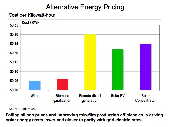
The Alternative Energy Pricing chart was base on research from Solarbuzz which is one of the leading research firms in solar energy. The cost per KWH that Solarbuzz provides is a global average. Even with cost per watt falling below $1.00, the system costs after installation are closer to $5.00 according to Abound Solar (formerly known as AVA Solar) and is still higher than parity with grid with a cost of $0.21 per KWH.
The bottom line is that despite the lower PV panel costs; we are still not at parity with hydrocarbon fuels such as coal and oil. Carbon based taxing or alternative energy stimulus and more investment into alternative energy is required to improve the economics of solar and wind.
Dramatic Drop in Oil Consumption – What’s the Implication?
America’s appetite for oil declined sharply as the economy weakened over 2008. According to the latest reported information from the Energy Information Administration (EIA), Monthly Oil Consumption oil consumption declined 13% y/y from September 2007 through September 2008.
Historically, the US has seen this type of demand erosion before. From 1979 to 1983, oil demand in the US declined 28% with annualized rate of a 10% decline per year. Over this same period, oil prices actual rose despite the fall in demand. Oil prices by barrel (42 US gallons) rose from $3.60 in 1972 to $25.10 in 1979. In 1983, oil prices increased to $29.08 a barrel, representing an increase of nearly 16% from 1979.
Economics would normally dictate that as demand declines so should prices. However, the geopolitical events and oil supply disruption maintained higher oil prices despite the subsequent decline in oil demand. It was not until structural changes in energy conservation and driving patterns were felt before leading to a fall in oil prices during the 1980’s.
Figure 1 Monthly Oil Consumption 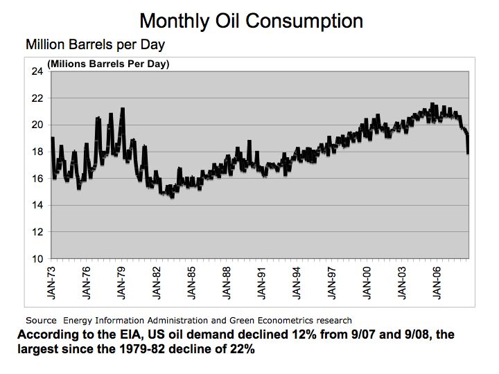
As illustrated in Figure 1, the precipitous fall in oil demand over the last half of 2008 is quite dramatic in comparison to historical price data. The large fluctuations in monthly oil consumption during the 70’s and 80’s, were primarily due to supply disruptions. The higher oil prices resulting from supply disruptions over this period led to structural changes in the energy market that later resulted in falling oil prices.
Figure 2 Oil Prices 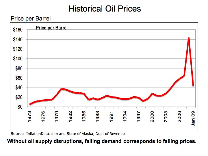
While falling demand and rising oil prices during the 70’s and 80’s is an anomaly, we see from Figure 2, that currently there is significant correlation between falling oil demand and a subsequent decline in the price of oil. Excluding the peak oil price in July 2008, oil declined 33% from the average price per barrel of $64 in 2007.
Perhaps the precipitous fall in oil prices can explain why demand for oil on a global basis has not declined as dramatically as in the US. As we can see from Figure 3, the drop in US oil consumption is matched with a slight increase in demand in Europe and only a moderate decline in Japan.
Figure 3 Global Oil Demand 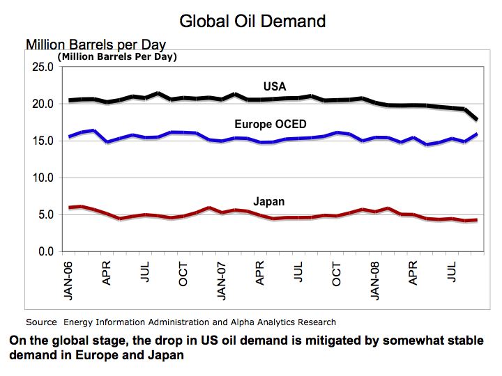
The bottom line is the financial shock that hit global markets is dramatically impacting consumption. As a recovery inevitably ensues, demand for oil will increase and so will oil prices. Let’s not be complacent with hydrocarbon fuels. Falling energy prices act as a disincentive for investment into alternative energies.
A Historical Perspective on Energy Prices and Economic Challenges
To understand current energy prices it may serve us to examine historical energy prices. Our theme is energy economics and specifically that energy prices follow the laws of supply and demand to set pricing.
There are some interesting perspectives on historical energy prices from several books including Security Analysis, 1940 edition by Benjamin Graham and David Dodd, The Great Wave, by David Hackett Fischer; and The Industrial Revolution in World History, by Peter Stearns. These books provide extensive data on pricing, industry revenues, and the framework that energy and technology serve in the economics of the industrial world.
Figure 1 Historical Energy Prices 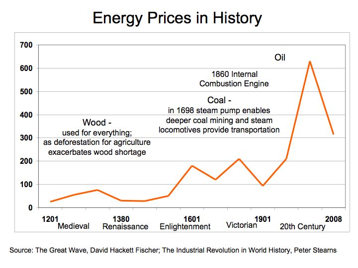
With the risk of oversimplification, our first figure shows there have been four distinct energy prices waves that have rippled through history. The scarcity of wood that was used for building homes, heating, and tools became increasing scarce as deforestation spread through Europe in the 1300s and followed again in the 1600’s. Coal prices rose rapidly with the War of 1812 and the Napoleonic Wars. Oil prices peaked in 1982 and to an all time high of $145.16 on July 14, 2008.
Figure 2 Medieval Wood Prices 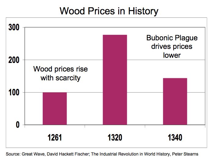
During the Medieval period in world history wood prices increased nearly threefold according to David Fischer in the The Great Wave. Wood prices rose with scarcity and peaked in 1320 as impact of the Bubonic Plague began to kill a quarter of Europe’s’ population. Twenty years from its peak in 1320, wood prices declined by 48% as the Bubonic Plague reduces the population and in turn, lowering the demand for wood.
Figure 3 Wood Prices 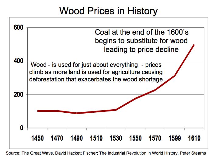
Figure 3. Illustrates the rapid rise in the demand for wood as the growing world populations benefited advances in science and agriculture from the Renaissance period. Wood is used for just about everything and prices climb as more land is used for agriculture leading to deforestation exacerbating the wood shortage. As demand for wood increases, prices subsequently follow. By the end of the 1600’s, coal begins to substitute for wood as an energy alternative.
With advances in technology came improvements in coal mining and transportation that allowed coal to substitute for wood as an energy source. With the invention such as Thomas Newcomen’s steam, powered pump in 1712 that facilitated coal mining and James Watt’s steam engine in 1765 that lead to advances in transportation including railroads and machinery, coal grew in importance as an energy source. These advances in technology enabled greater supplies of coal to enter the market which lead to declines in energy prices.
Figure 4 Coal Prices 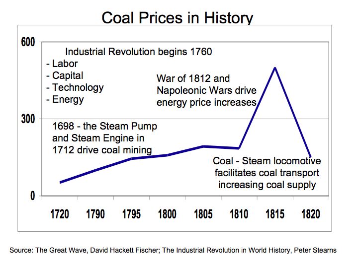
We can gleam from Figure 4 that coal prices peaked in 1810-to-1815 coinciding with the War of 1812 and the Napoleonic Wars. The technological advances in mining and transportations fostered the development of an infrastructure to support the coal industry. The price of coal rose as wars ragging in Europe and the US, increased the demand for materials and supplies such as coal. However, as the wars came to an end, the abundant supplies of coal allowed prices to fall keeping energy prices low.
Oil entered the picture with the drilling of the first oil well in northwestern Pennsylvania in 1859 and the Internal Combustion Engine in 1860 that facilitated the development of the oil industry.
As oil emerged to become the dominant fuel of the 20th Century, it’s only recently that we face supply shortages. To better understand the dynamics of energy pricing in the face of changing demand, a review of spending on railroads and electricity may serve as a surrogate for discretionary and consumer stable spending patterns.
Figure 5 Industry Segment Revenues 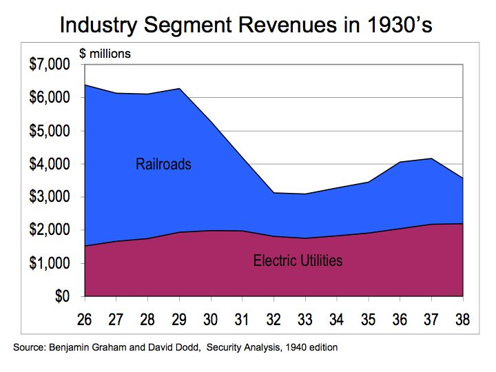
Figure 5 illustrates changes in the aggregate revenues of railroads in comparison to electric utilizes during the Great Depression. Copious notes taken by Graham and Dodd for their book Security Analysis help to demonstrate the economic laws of supply and demand.
The change in demand was most pronounced in railroad revenues. Expenditures on railroads, the more discretionary of the two industries, declined 51% from 1929 to 1993 as measured by gross receipts for the railroad industry. Over this same period, spending on the consumer stable, electricity only encountered a decline of 9%. In economic terms, railroads demonstrate greater demand elasticity meaning there is greater change in demand at prices change or this period, disposable income. While there is some discretionary portion of our spending associated with oil, a large portion of spending on oil is out of necessity. Therefore, even during times of great economic distress, the propensity for energy consumption is not eradicated entirely.
The bottom line: Energy pricing will continue to be dictated by supply and demand. Hydrocarbon fuels such as oil are finite in nature and therefore, without definitive strategies to cultivate alternative energy resources we will remain hostage to the vagaries in energy prices..
Don’t let the fall in Oil Prices Lead to Energy Complacency
The precipitous drop in oil prices may not hold for long. Speculators and fears of oil flow disruptions drove oil prices to an all time high of $145.16 on July 14, 2008 and is now down to $49.50 in November 20, 2008. Now the fear has shifted to the economy where deteriorating fundamentals suggest demand for oil will abate, at least in the near term. However, if history is any guide, demand for oil should be influenced by both structural changes such as consumers driving more fuel-efficient motor vehicles and cyclical factors such as the state of the economy.
Figure 1 US Historic Oil Imports 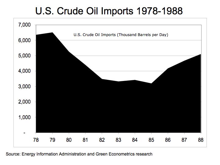
To get an understanding of the impact that both structural and economic factors had in reducing the demand for oil is to look at oil import from 1978 to 1988. Figure 1 illustrates the US demand for oil during the last major economic recession. The Oil Shock of the 1970’s severely impacted the US economy and the term stagflation captured our attention while interest rates reached exorbitant levels. From 1979 to 1982, US oil imports decline by 46% as the oil embargo of 1973 led to structural changes in oil consumption. US oil imports, as measured by the Energy Information Administration in U.S. Crude Oil Field Production (Thousand Barrels per Day) demonstrated a significant decline as a result of changing driving habits as fuel efficient import vehicles encroached on the domestic auto makers. The US consumers opted for foreign vehicles demonstrating higher fuel efficiencies and MPG entered our lexicon. These economic and structural changes dramatically reduced the demand for oil and subsequently, oil prices fell. It was not until 1985 before oil imports began to increase.
What’s missing from this analysis is the fact that during this period the US accounted for 27% of total world oil demand. . According to the Energy Information Administration (EIA), in 1980, China and India accounted for 2.8% and 1.0%, respectively, of the global demand for oil. In 1986, China and India increased their oil demand to account for 3.2% and 1.5% of the world market, respectively, an increase in oil demand of 57% for China and 44% for India.
In 2005, China and India account for 8.0% and 2.9% of global oil demand while US dropped to 24.9% of global oil demand. While even China and India are not immune to the current blissful economic environment, when the global economy does improve, their demand for oil will more than negate any structural changes the US consumers make in their driving habits. The demand for oil should continue to grow as an economic recovery ensues thereby leading to an increase in oil prices.
Figure 2 China and India Oil Consumption 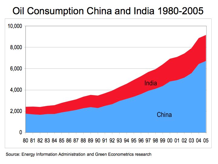
Figure 2. illustrates the rapid rise in the demand of oil from China and India. From 1980 to 2005, demand for oil increased 280% in China and 125% in India. Despite the improving fuel consumption in the US, the global oil market is more apt to be impacting from the growth in developing countries than conservation in the US.
The bottom line: don’t remain complacent, strive for energy efficiency and invest into alternative energies.
For further reading on oil prices please refer to
oil price analysis .
